CSS ::before and ::after
On this page are a couple of examples demonstrating what you can do with ::before and ::after pseudo-elements in CSS.
The examples use unprefixed CSS. For older browsers you might want to put the CSS through autoprefixer.
CSS3 syntax
::before
::after
CSS2 syntax
:before
:after
Examples
- Adding quotation marks
- Creating a speech bubble
- Making a tile clickable
- Darken an image
- Defining a 16:9 ratio
- Adding a hover effect
- Preventing right-clicking to download images
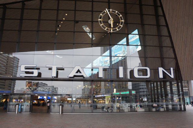
Photo in the examples is the main entrance of Rotterdam central station, The Netherlands taken by Walter Ebert.
Adding quotation marks
A random quote
Ein willkürliches Zitat
<style>
q {quotes: "\201e" "\201d";}
q:lang(de) {quotes: "\00bb" "\00ab";}
q::before {content: open-quote;}
q::after  {content: close-quote;}
</style>

<q>A random quote</q>

<q lang="de">Ein willkürliches Zitat</q>
Creating a speech bubble
Speech bubble text
<style>
.bubble {position: relative; background: #ddd; border-radius: 10px; border-bottom-right-radius: 0; display: inline-block; margin-bottom: 40px; padding: 20px;}
.bubble::before {position: absolute; content: ""; display: block; bottom: -20px; right: 0; background: #ddd; width: 20px; height: 20px;}
.bubble::after {position: absolute; content: ""; display: block; bottom: -40px; right: 0; background: #fff; width: 40px; height: 40px; border-radius: 20px;}
</style>

<div class="bubble">Speech bubble text</div>
Making a tile clickable
Article with ::before
Article with ::after
<style>
.excerpt {position: relative;}
.excerpt a::before {content: ""; position: absolute; top: 0; right: 0; bottom: 0; left: 0;}

/* Alternatively you can also use ::after instead of ::before */
.excerpt a::after {content: ""; position: absolute; top: 0; right: 0; bottom: 0; left: 0;}
</style>

<article class="excerpt">
  <img src="thumbnail.jpg" alt="Centraal Station Rotterdam">
  <h2><a href="https://station.gallery/2018/03/23/rotterdam-the-netherlands/">Title</a></h2>
  <time datetime="2018-03-23T20:18:54+01:00">23th March 2018</time>
</article>
Darken an image
Centraal Station Rotterdam
Centraal Station Rotterdam
(with dark background)
Centraal Station Rotterdam
(with dark gradient)
::before does not work with replaced elements like <img>.
<style>
.tile {display: inline-block; position: relative;}
.tile h3 {color: #fff; position: absolute; top: 0; right: 0; bottom: 0; left: 0; margin: 0; padding: 1em 2em; display: flex; align-items: center; text-align: center;}
.tile img {float: left; max-width: 100%; height: auto;}
.tile--darken::before {content: ""; display: block; position: absolute; top: 0; right: 0; bottom: 0; left: 0; background: rgba(0, 0, 0, 0.5);}
.tile--dark-gradient h3 {align-items: flex-end;}
.tile--dark-gradient::before {content: ""; display: block; position: absolute; top: 0; right: 0; bottom: 0; left: 0; background: linear-gradient(0deg, rgba(0, 0, 0, 0.6), transparent);}
</style>

<div class="tile">
  <h3>Centraal Station Rotterdam</h3>
  <img src="background.jpg" alt="">
</div>

<div class="tile tile--darken">
  <h3>Centraal Station Rotterdam</h3>
  <img src="background.jpg" alt="">
</div>

<div class="tile tile--dark-gradient">
  <h3>Centraal Station Rotterdam</h3>
  <img src="background.jpg" alt="">
</div>
Defining a 16:9 ratio
Image shown with a 16:9 ratio
Image shown with a 4:3 ratio
<style>
.ratio-16-to-9, .ratio-4-to-3 {position: relative; overflow: hidden;}
.ratio-16-to-9::after {content: ""; display: block; padding-top: 56.25%;}
.ratio-4-to-3::after {content: ""; display: block; padding-top: 75%;}
.ratio-16-to-9 img, .ratio-4-to-3 img {position: absolute; width: auto; height: auto; min-width: 100%; min-height: 100%; top: 50%; left: 50%; transform: translate(-50%, -50%);}
/* object-fit would be nicer, but not supported by IE ¯\_(ツ)_/¯ */
/* .ratio-16-to-9 img, .ratio-4-to-3 img {object-fit: cover;} */
</style>

<article class="excerpt">
  <div class="ratio-16-to-9">
    <img src="thumbnail.jpg" alt="Centraal Station Rotterdam">
  </div>
  <h2><a href="https://station.gallery/2018/03/23/rotterdam-the-netherlands/">Image shown with a 16:9 ratio </a></h2>
  <time datetime="2018-03-23T20:18:54+01:00">23th March 2018</time>
</article>

<article class="excerpt">
  <div class="ratio-4-to-3">
    <img src="thumbnail.jpg" alt="Centraal Station Rotterdam">
  </div>
  <h2><a href="https://station.gallery/2018/03/23/rotterdam-the-netherlands/">Image shown with a 4:3 ratio</a></h2>
  <time datetime="2018-03-23T20:18:54+01:00">23th March 2018</time>
</article>
Adding a hover effect
Centraal Station Rotterdam
::before does not work with replaced elements like <img>.
<style>
.tile {display: inline-block; position: relative;}
.tile--hover::before {box-shadow: inset 0 0 0 160px rgba(0, 0, 0, 0.4); content: ""; display: block; position: absolute; top: 0; right: 0; bottom: 0; left: 0; transition: all 300ms;}
.tile--hover:hover::before {box-shadow: inset 0 0 0 0 rgba(0, 0, 0, 0.4);}
.tile--hover h3 {opacity: 1; transition: all 300ms;}
.tile--hover:hover h3 {opacity: 0;}
</style>

<div class="tile">
  <h3>Centraal Station Rotterdam</h3>
  <img src="background.jpg" alt="">
</div>
Preventing right-clicking to download images
::before does not work with replaced elements like <img>.
<style>
.prevent-image-download {display: inline-block; position: relative;}
.prevent-image-download::before {content: ""; position: absolute; top: 0; right: 0; bottom: 0; left: 0;}
</style>

<span class="prevent-image-download"><img src="image.jpg" alt=""></span>